


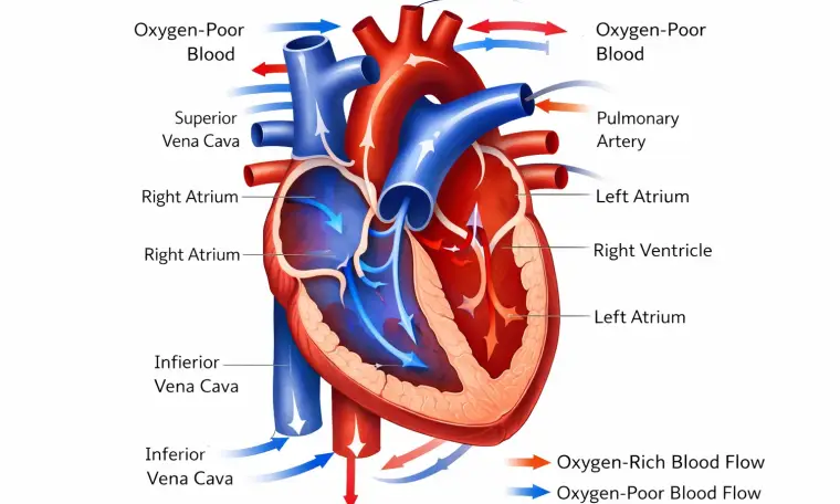
Heart Blood Flow Diagram: Visualizing Cardiac Circulation from Entry to Systemic Output
A heart blood flow diagram provides a simplified visual representation of how blood moves through the heart, but its value depends entirely on how well the viewer understands its components. Most diagrams use color coding, directional arrows, and labeled structures to illustrate the transition between deoxygenated and oxygenated blood.
Typically, blue indicates deoxygenated blood returning from the body, while red represents oxygenated blood being delivered outward. The diagram will show blood entering the right atrium, moving to the right ventricle, and then traveling to the lungs. After oxygenation, the blood returns to the left atrium, enters the left ventricle, and is pumped into systemic circulation.
Arrows are used to indicate direction, and their placement reflects the sequence of flow. Misinterpreting these arrows is one of the most common errors, especially when the diagram is viewed without considering anatomical orientation. The right side of the heart appears on the left side of most diagrams, which can lead to confusion if not recognized.
Valves are often depicted as simple openings, but they represent pressure-sensitive structures that regulate flow between chambers. Understanding their role is essential for interpreting the diagram accurately, as they ensure that blood moves forward without reversal.
A well-understood heart blood flow diagram allows the viewer to visualize the entire circulatory loop quickly. It transforms an abstract physiological process into a coherent sequence, making it easier to grasp how disruptions in one area can affect the entire system.


